The world of social media is ever-changing, and Facebook is generally at the forefront of such change, updating its algorithm constantly. Many other social media channels such as Twitter and Instagram soon follow suit to keep up with the social media giant.
Well, Facebook has done it again. Or should I say, IS doing it again. Facebook is rolling out a new template for its business pages. The changes first started a few weeks ago, but as time has gone on, Facebook has rolled out the changes to more people. The slow rollout process is a favorite of Facebook, who has a history of introducing changes to its users at a slow, yet deliberate, pace. (Some are still awaiting the “Time-Hop” feature first introduced over a year ago.)
Let’s take a look at the changes and how it will impact your business…

Let’s start with the obvious differences:
Profile Picture and Cover Photo
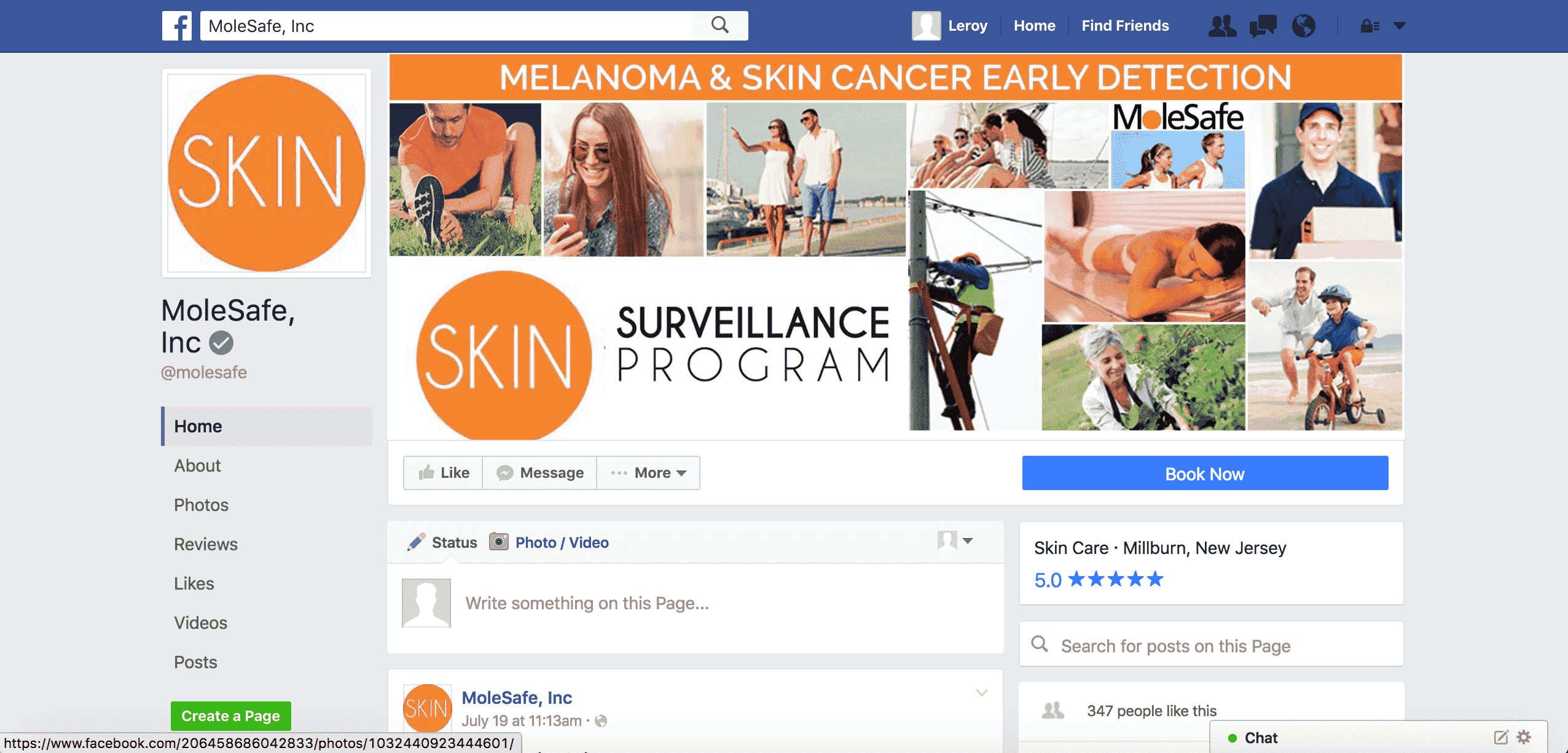
The profile picture has long been laid over the bottom left-hand corner of the cover photo, allowing for interesting design choices that incorporate both the profile and cover photos. With Facebook’s new layout, the profile picture has shifted completely apart from the cover photo to the left side of the page.
The new layout changes how your eye meets the page and thus changes the importance of the images used. Rather than viewing the profile/cover photo in conjunction, now your eye is drawn solely to the cover photo.
So, is the profile picture now obsolete? Not quite. The new layout will surely pique the interest of any design-oriented mind from which many questions will arise. Questions such as, “How can the two work together now?” and “Do I even want them to work together?”
Call-to-Action and Reviews
“Look at me!” “Click me!”
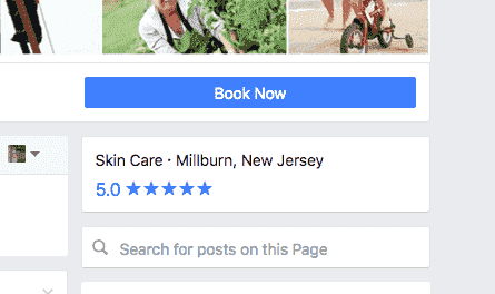
 The new and improved call-to-action button is begging for you to click it. Like never before, the button stands out as a staple on your business page, and it needs to be loved. Previously a light gray box with dark gray text, the call-to-action button now features white text silhouetted in a radiant blue box which occupies significantly more space than its gray counterpart.
With the updates of the call-to-action button, people viewing your Facebook page will be more likely to click on the new enticing blue box and then carry out whichever call-to-action you have set up on the page.
Directly below the call-to-action button sits the reviews for your business. This is in direct contrast to the old layout, which featured the reviews on the left side of the page under the section where the profile picture used to sit.
The reviews section is now more easily located, as it sits directly beneath the bright blue call-to-action button. People visiting your page will be more likely to look at the reviews and submit a review themselves with the new format.
Home, About and Create a Page
Just as the profile picture shifted away from its joint location with the cover photo, so too have the Home, About and Photos sections. These links have now moved to the left side of the page, under the profile picture. However, unlike the profile picture, this move makes the selections stand out more, as they were previously lost in the fray that was the cover photo section of old. The new arrangement encourages you to explore the business’ page.
The new layout also encourages users to “Create a Page.” Although this was included on the old business profile layout, the fluorescent green button has moved from the seldom looked at top right corner of the page, and now joins the profile picture and exploratory selections donning the left side of the page. This move was most likely carried out due to the fact that the space on the right side of the page is a common location for ads and thus the “Create a Page” button was getting tossed into the “ad” category.
Sponsored Content and Ads
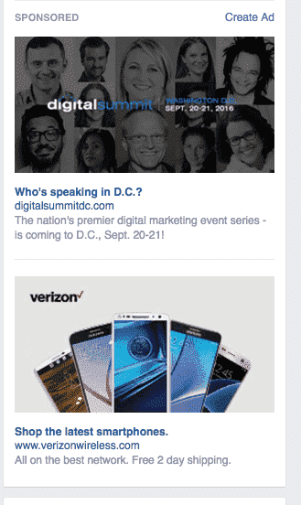
 As I just noted, the right panel of Facebook has long been reserved for sponsored content and ads. With the introduction of the new Facebook layout, say goodbye to sponsored content gracing the right side of the page.
Just a few months ago, Google announced it would be removing right rail ads from its page, moving the ads to the top or bottom of the page. It took Facebook five months to catch up, but it has finally followed suit, removing ad content from the right rail (right side of the page). “Where will ads appear now?” you ask. Ads have been added to your feed and look identical to posts from your friends and family.
Facebook took the hint from Google, removing ads from the right rail and inserting them in a more natural way, right into the feed you would see when first logging in. For now, ads still appear on the right rail when you first log in. The difference here is that there is no way, at least not yet, for a company to reach you with advertising when you’re looking at a page.
The leader in users on its platform, Facebook will continue to be at the forefront of change, and it is our duty to keep you abreast of such changes. With the introduction of the new layout, businesses, like yours, will need to adapt Facebook pages. At Points Group, we’ve got you covered with the latest news and how it will affect you. If you have any questions about the new layout, ask away!


